


Rebranding for a New Paradigm
Enabling an industry-leading IT field services provider to articulate a revolutionary Remote IT Field Services Management vision.
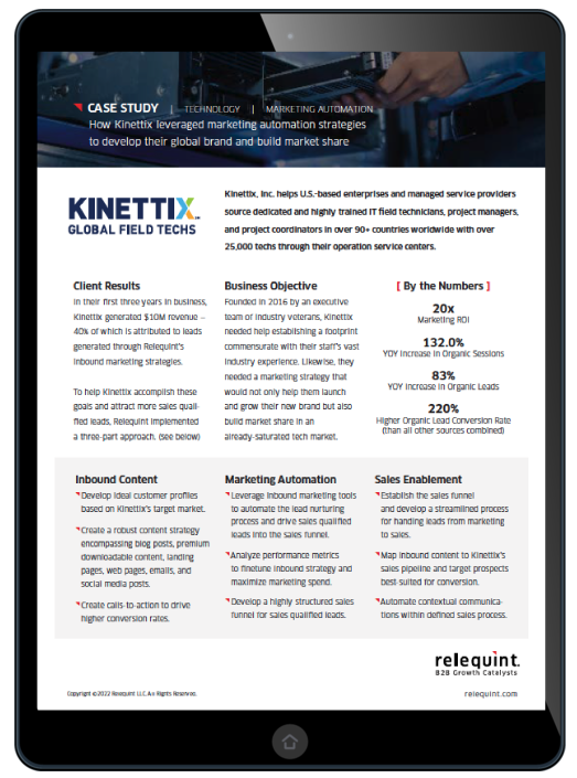
Kinettix, an industry leader in global IT field services, recognized the imperative for a robust brand evolution to align with its forward-thinking objectives. To execute this transformation, Kinettix engaged Relequint, a renowned B2B branding agency, to develop a sophisticated brand identity that cohesively integrated its innovative services: Dispatch1, FieldFlex, and Kinettix Field Services.
"You have effectively assisted us in developing a brand structure that caters to the diverse requirements of multiple prospects while preserving the strong brand reputation we currently have for Kinettix Field Services."
— Kinettix CEO, during the brand architecture reveal
Relequint constructed a brand architecture that coalesced Dispatch1’s field service management capabilities, FieldFlex’s specialized staffing, and Kinettix Field Services’ on-site proficiency. A refined color system was also developed, employing a palette that conveys reliability and innovation.

Kinettix 'X' Brand Mark
![]()
Kinettix Logo
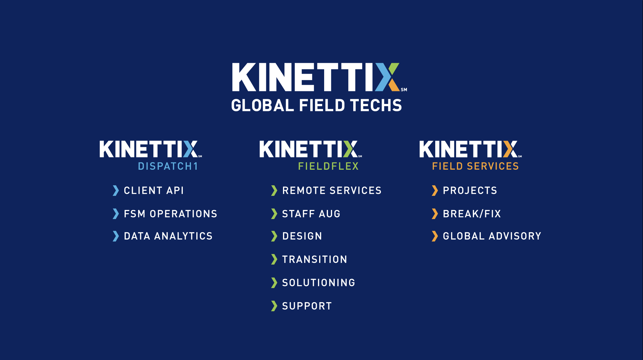
Central to the rebranding is the logo redesign. Relequint tactfully integrated the new color scheme into Kinettix’s “X,” which is emblematic of the symbiosis among the services. The intelligent interplay of hues in the “X” represents the multifaceted capabilities of Kinettix’s offerings—Dispatch1 is the light blue arrow representing the underlying Field Services Management Platform driving all projects; Kinettix Field Services is represented by the orange leg of the "X" and is still the primary source of revenue; Kinettix FieldFlex is the newest offering represented in the bright green arm of the "X" leading to the future for both Kinettix and the industry.

Kinettix Brand Video
Relequint developed a thoughtfully crafted brand video to clarify Kinettix’s refined identity and services. The video provides an insightful overview of the integrated capabilities of Dispatch1, FieldFlex, and Kinettix Field Services through crisp visuals and concise scenarios.

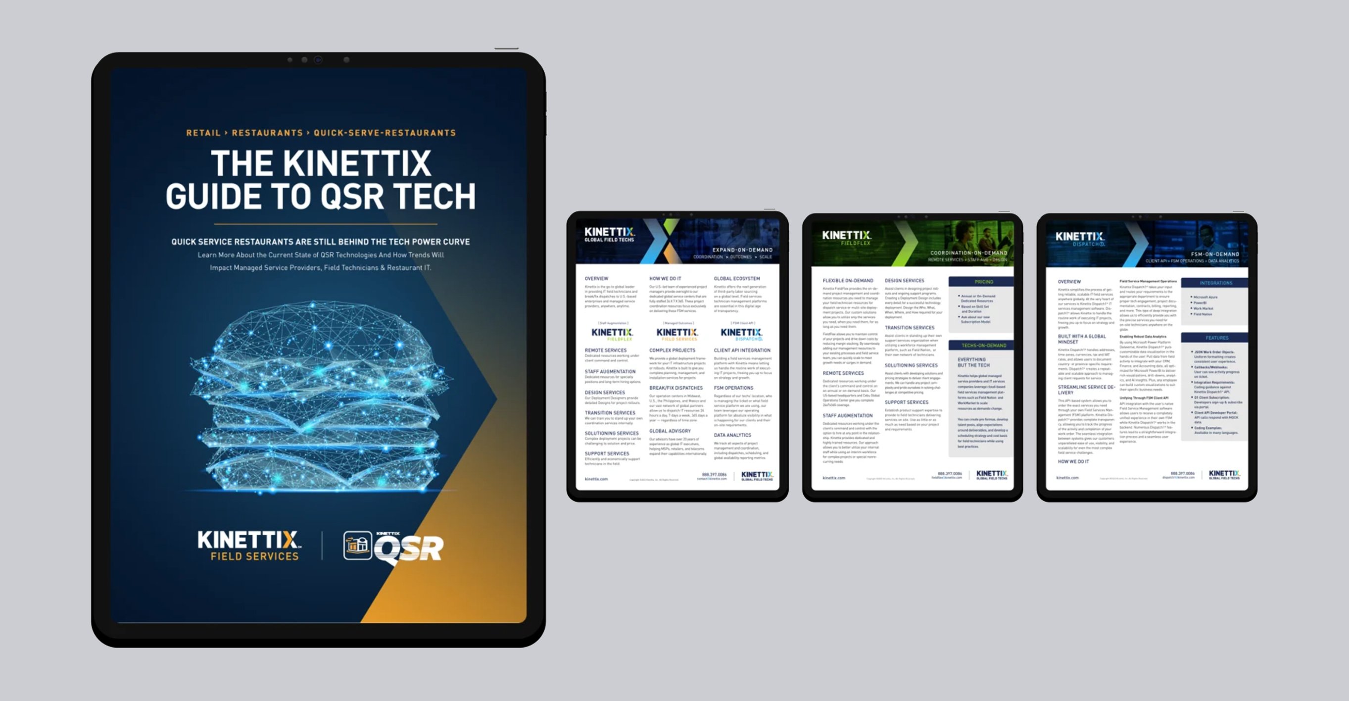
The redesigned website at Kinettix.com, created by Relequint, showcases a modern and functional design with simplified navigation resulting from the optimized brand architecture. With its user-friendly interface and emphasis on delivering comprehensive information, the website digitally represents Kinettix's evolved brand philosophy.
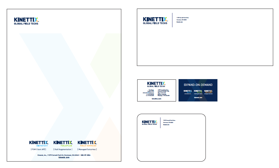
Relequint carefully oversaw the redesign of Kinettix's collateral, guaranteeing a smooth and refined brand image. By thoughtfully integrating the new logo and color scheme into various materials such as brochures and business cards, Relequint demonstrated a commitment to brand consistency that resonates with existing and potential clients. The cohesive visual representation across all collateral reinforces the brand's identity, conveying professionalism and reliability that distinguishes Kinettix within the industry. Each piece of collateral is expertly crafted to reflect the new branding elements, solidifying Kinettix's image and leaving a lasting impression on stakeholders, instilling confidence in the company's dedication to excellence.

The rebranding effort extends to the physical space of Kinettix, where the expertise of Relequint is showcased through a minimalist design approach in the lobby of the Kinettix APAC headquarters. By incorporating the new branding elements into the space, the lobby now exudes a sense of modernity and sophistication, creating an environment that welcomes visitors and represents Kinettix’s unwavering commitment to innovation. The sleek and clean design elements and the strategic placement of the brand logo and colors create a visually stunning ambiance that leaves a lasting impression. This revamped physical space is a tangible embodiment of Kinettix's rebranding efforts, showcasing its dedication to staying at the forefront of the industry and providing a seamless experience for clients and stakeholders.


Relequint's expertise extended beyond the digital realm as they meticulously crafted the development of Kinettix's apparel. With meticulous attention to detail, they seamlessly incorporated the new branding elements into the design, ensuring a refined and professional representation of the brand. Incorporating the updated logo and color scheme makes the apparel a compelling visual embodiment of Kinettix's rebranding efforts. This consistent and unified approach reinforces the brand's image among stakeholders, leaving a lasting impression and solidifying Kinettix's unwavering commitment to excellence. Whether it's employees proudly wearing the apparel or stakeholders spotting it at industry events, the consistent visual representation is a constant reminder of Kinettix's innovative and forward-thinking approach to remote IT field services management.
Kinettix’s rebranding, orchestrated by Relequint, represents a strategic realignment that positions Kinettix at the forefront of innovation in remote IT field services management.